Something Brand New & A Fine Art Giveaway

Behind the Wall

P5010029-009.JPG

My friend in the Midwest shared some precious photos with me this week.  She kindly said I may share them with you.  On her porch, a little mommy robin has taken up residence in her flower pot.  ​Evidently she felt it was the perfect secret little place to build her nest.  It is sheltered.  It is warm.  It is safe.  It is home, for now.

IMG_2800.jpg

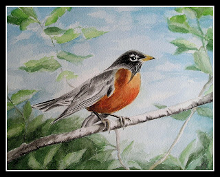
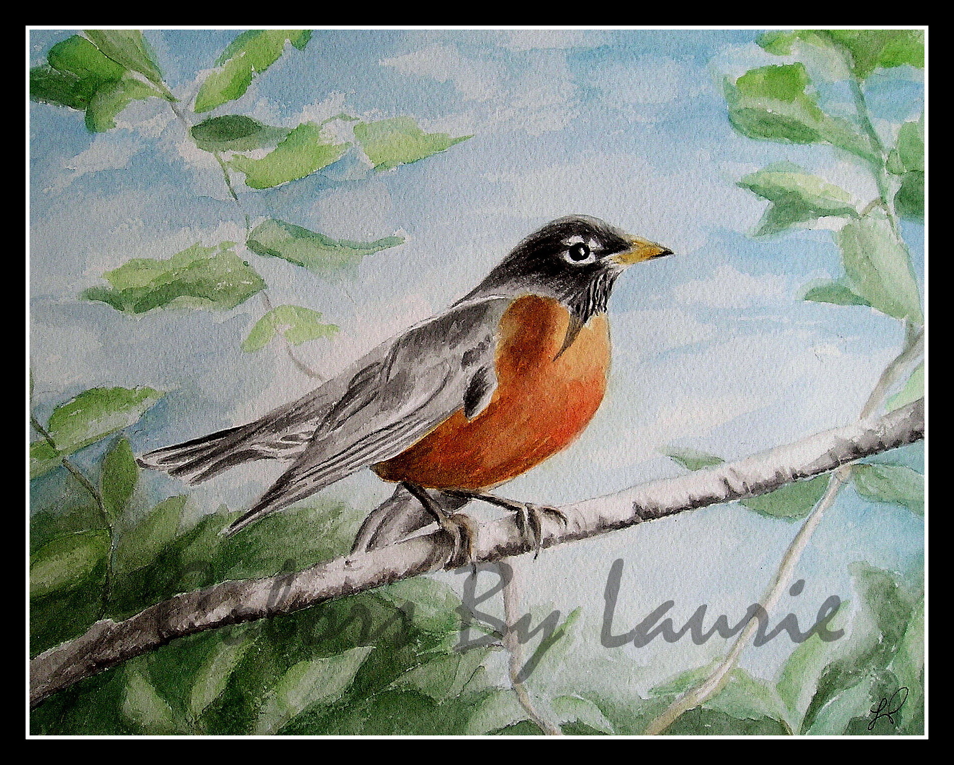
I have always loved robins.  They're out and about every Spring and they live everywhere.  They ALWAYS remind me of the "cheeky little beggar" in "The Secret Garden" by Frances Hodgson Burnett.  He is the sassy little bird that is present in nearly every chapter.  He is the little orphan girl's very first friend.   He knows the secrets behind the wall, and he leads the way for her to a whole new world.  As the garden comes to life, so do the children who tend it.  This beloved children's classic, was a favorite of our family, and now our grandchildren are reading it too.  If you've never read it, even as an adult, I highly recommend it. 

Come on in!

The original 1911 cover.​

The original 1911 cover.​

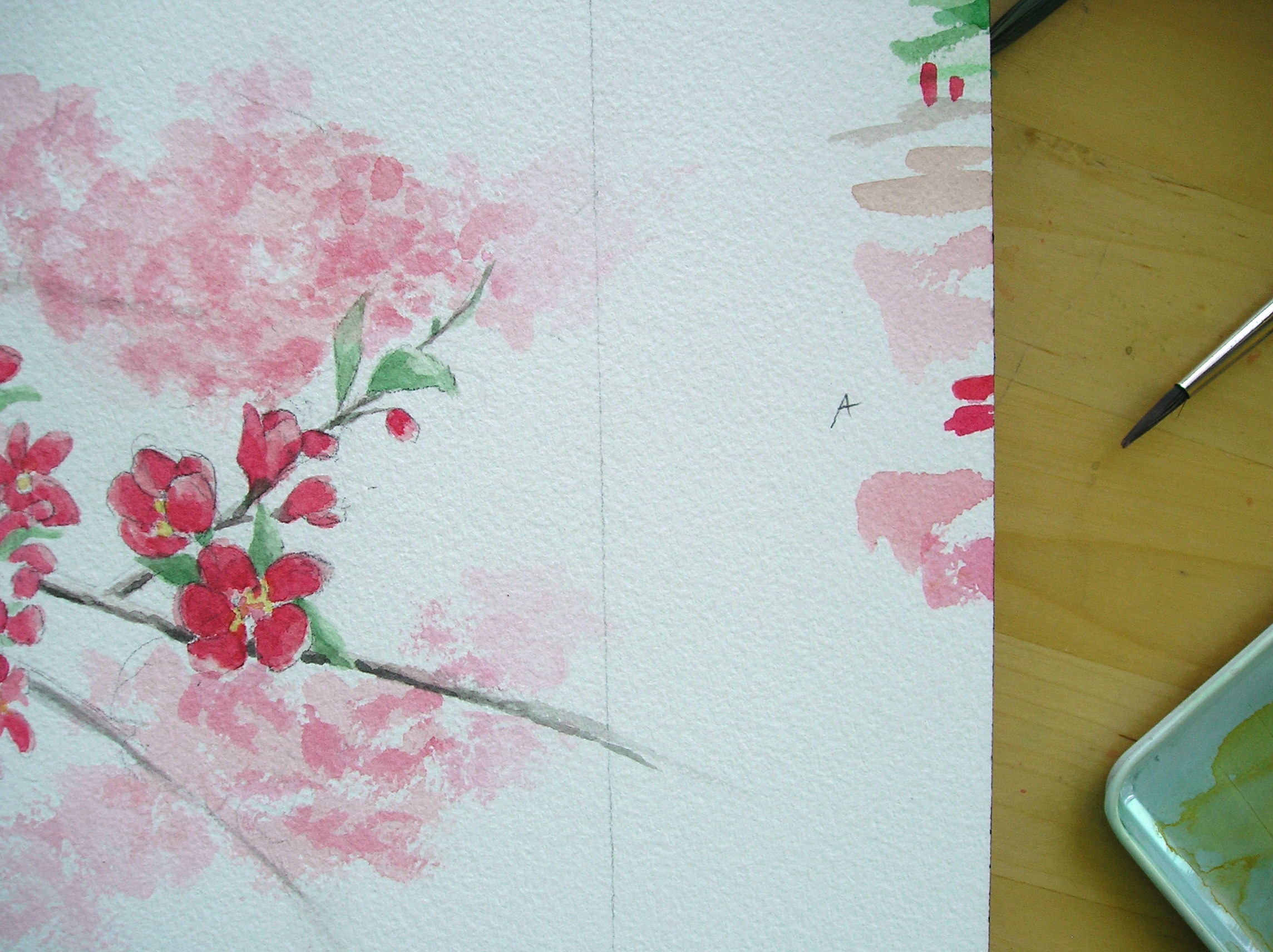
I would like to invite you inside my very own "Secret Garden."​  I am excited to open the door for you and show you what's been growing here.  I've been putting together a collection of paintings based on this book and getting the fine art prints ready to share.

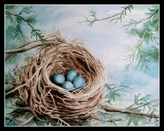
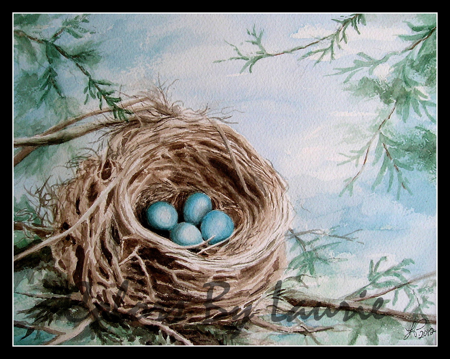
The robin inspires me with his industrious little life.  Like most birds, robins are always busy, searching out nesting spots, or gathering twigs.  While they are taking care of their responsibilities, we reap the benefits.  What is more lovely than blue robin eggs tucked into a well built nest?  How about Robin's red feathers contrasted with green grass as he tugs on a worm?

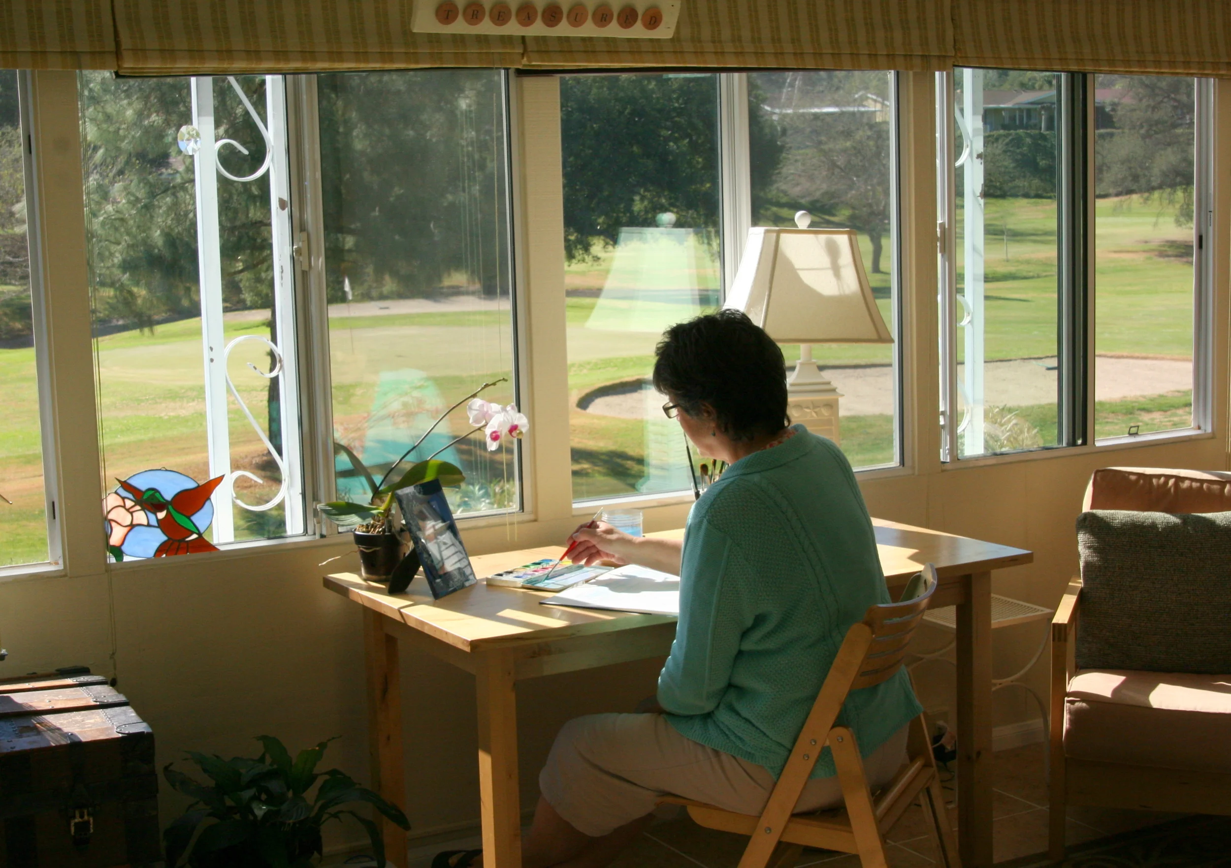
My husband, Gary has early-onset Alzheimer's Disease.  Through watercolor painting, I have found a way to express my love for the beauty around me, bless my husband, and provide visual delights for you to enjoy. Thank you for your support which allows me to stay by Gary's side.  I would be so grateful if you tell your friends as well. 

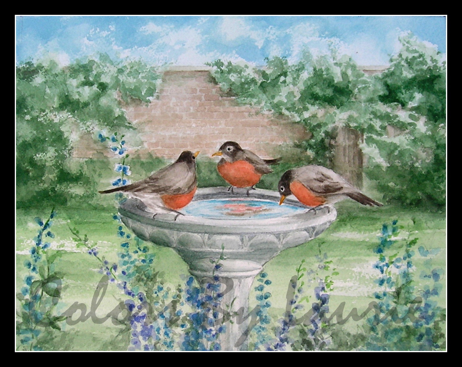
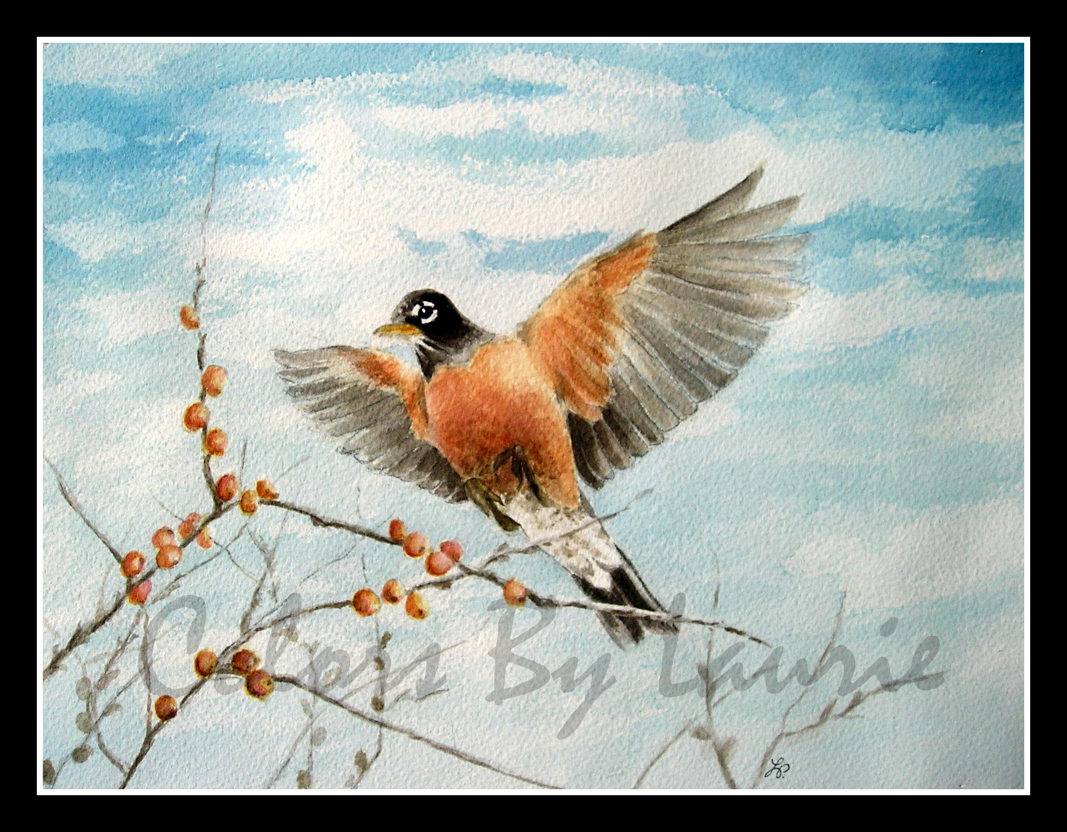
The "Secret Garden" Collection

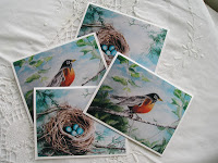
Four original watercolor paintings and fine art prints

based on the book, by Francis Hodgson Burnett  ​

​The First  Big News

Along with these original 8 X 10 framed paintings, I'm offering FINE ART PRINTS!  This has been in the works for some time, so I'm thrilled to tell you about it.  You can purchase them framed or unframed.  You can buy a painting, or a print, or a set and each image comes with a journal entry with my thoughts.  These paintings and prints are ready to order.  Clicking on any image will take you to the gallery page for more details.  Or click HERE

The Other Big News!

A Fine Art Print Giveaway from this collection!  ​Here's how it works... If you win the drawing you choose the 8 X 10 print of choice from this collection.

  1. Leave a comment on this blog, (at the bottom of THIS page where it says COMMENTS) and tell me what subject you would like me to paint next.
  2. The drawing is going to be held on ​Saturday, May 11, 2013 at 6:00 PM PST. 
  3. I will post the winner's name on a new blog post that night.  The winner will have one week to contact me or I will draw a new name.  ​


IF YOU ARE ASKED TO 'CREATE AN ACCOUNT' OR 'LOG IN'

  • Create Squarespace Account:" Enter name, email and password.  THEN
  • "Log In:" Enter email, and password.  Then click "Sign In."​

IF YOU ARE AN ​EMAIL BLOG FOLLOWER:

  • You must "READ IN BROWSER" in order to leave a comment.

Like Mary in the story, I am grateful for the friends God has brought into my life.  Thank you for ​your interest, loyalty and love.  It's a joy to share my world with you.

​With Pleasure,

Laurie

Julie's painting is finished!

(​Continued from yesterday's blog.)

​This afternoon, I made the changes on my list.  I added a few more flowers both in the foreground and the background, to improve the composition.

P4170002-003.JPG

Here's a close up.​

​Now it is time to add the dark reds and greens.  By adding the shading, the flowers take shape and have depth.  It is shadows and highlights that give form.  I added the same reds and greens to the background flowers, but by "dabbing" them in, not "brushing" them in.  I want the background to look "fuzzy."  Finally I added all the details like the little sprigs, buds, and branches.  Feeling satisfied with these cherry blossoms, I smiled, and got ready for the final stage. 

Remember the font I chose in the planning stage?  In my Word program I formatted the letter for size.   

FINAL_LOGO_RGB_7.29.12-007.jpg
P4180001-003.JPG

Position the Monogram, making sure the size is right for the space.

Sometimes it takes a few tries to get it right. 

P4180002-002.JPG

Remember this step?  Use a pencil to darken the lines on the back side of the paper so it can be transferred to the painting.  ​I tape it to the window, to see the lines through the paper. 

I taped the "D" Monogram drawing on the painting and transferred the "D" to the painting by tracing the lines with my pencil.  Next, I carefully painted in the black.​ 

P4180003.JPG

So, Julie D., here is your painting.  I hope you like your prize.  I really enjoyed painting it for you, and I hope it finds a nice place in your Craftsman style home.  To the rest of you who have been looking over my shoulder these last few days, I've loved sharing with you.  I wish I could paint one for each of you.  It was a fun contest, and a treat to paint these red blossoms.  Springtime blessings to everyone!

"Red Cherry Blossoms" Monogram with digital watermark added

"Red Cherry Blossoms" Monogram with digital watermark added

Wet Brushes

P4170001.JPG

Continuing with Julie's painting.  With the planning and drawing done, today we paint!  I like to paint with natural light.  Sometimes I hang a white sheet in front of the window to prevent shadows.  ​

P4170003.JPG

Water...check

Brushes...check

Paints...check

Paper Towels...check

​First I paint in the background very lightly, to make sure I like the layout.  I mix up a good red that I like, and then thin it with water for the light parts.  The "light red" is not really going to look "pink" when I'm done because with watercolors you must start out with the lightest parts of the painting first, and darker and darker colors as you go along, leaving exposed the light parts where you want them.  You'll see better as we go along.  Don't worry Julie, these blossoms ARE going to be red NOT pink. 

You can click on the photos to enlarge them and there's a small X in the upper right to click when you want to come back to this page.​

Since I don't have a photographic memory, I rely on my reference photos.  When I took the photo, I held my purse behind the flowers so they would stand out clearly.   Never mind the colors in the photo.  I just needed it for the shapes.

Next come the flowers in the foreground.  They will be the main event in this painting.  Because they are near, they will be distinct.  The ones in the distance will be lighter, and less sharp.  ​

The flowers are just painted simply at this point with no shading yet.  ​

Darker red paint is added to the flower petals, to show their shape.  I am careful to leave the lighter parts alone and put the darker red only where the shading would be. In the distant flowers, I add some blotchy darker red because I will want them to look like a bunch of reddish blossoms, not cotton candy. 

​Periodically, I step back from the painting, and make sure I like the composition, and colors.

P4170001-002.JPG

At this point, it was nearing time to make dinner, and Gary needed to get up from his nap.  (Today he was in the recliner, in the sunroom with me which I like.)   When I'm done for the day, I prop up the painting and every time I pass by, I see things I want to do tomorrow.  I keep a little paper near it, and jot things down to change or add.  A little more red here, an additional branch there, add some flowers over here, etc. 

I'm often asked how long it takes to create a painting.  This is a hard question to answer because of all the in between "thinking/looking" I do. 

I've rinsed out my brushes, and straightened up my desk, but ​I can't wait to get working again tomorrow.  Have a good night all.

"I am so excited, I'm shaking! I never win anything!!"

On March 23rd, Julie's name was drawn.​ "YAY!"

On March 23rd, Julie's name was drawn.​ "YAY!"

"Thank you SO very very much!!", continued Julie D., the winner of our contest!  Julie's original watercolor painting is underway and just as I promised, I'll be giving a step-by-step look at how I create a painting.  (To celebrate my brand new website, I recently hosted a drawing.  You can read about it HERE if you're curious.) 

So let's get started...

DIALOG WITH CLIENT:​

Julie let me know that she would like a Personalized Monogram watercolor with the letter "D" for her family name.  She loves cherry blossoms, and since she likes browns, whites, creams and red accents, she would like them to be red.  Her home is "Arts and Crafts" style.  We emailed back and forth a few times so that I could get a feel for her tastes. 

PLANNING:​

Every artist works differently, but I really get into the preparation.  My assignment was to find great cherry blossom pictures to use for reference, AND choose a great font for the "D."  ​

Grandmas and Granddaughters under a floral canopy

Grandmas and Granddaughters under a floral canopy

  • FIRST, the pictures...Good timing, because last week, we had a "Girls' Day" at beautiful Descanso Gardens.​  (If you live nearby, you really MUST GO.  Spring has Sprung!)  While we were there I grabbed some close ups of the cherry trees to use for Julie's painting. 

​Ideas

​Ideas

  • NEXT, I assemble my reference pictures, and Julie's ideas which will be used for layout, color, and theme.  I did a bit of research and found that there are no true red blossoms on cherry trees, BUT, that's were artistic license comes in.  From the pictures I saw, many trees appear red depending on the lighting, so no problem.  "Red cherry blossoms" it is! This pool of ideas will also answer the following very important question:  What exactly DOES a cherry blossom look like up close? 

Bungalow Heaven neighborhood

Bungalow Heaven neighborhood

  • ​LAST BUT NOT LEAST, find the perfect font for the monogram.  I want the monogram to reflect the "Arts and Crafts" style to be a good fit with her home.  A bit of background here, because I want to explain the font choice, AND just for fun, because we LOVE this architectural style. 

William Morris started the Arts and Crafts movement in England.  His philosophy opposed the mass production of the Industrial Revolution and emphasized the individual craftsman and artisan who work with their hands using local natural materials.  This followed the Victorian style with it's decorative embellishments and instead, emphasized simple, clean lines.   In America, the "Craftsman" style is very evident in the Bungalow.  In fact, nearby in Pasadena, you can explore the Bungalow Heaven neighborhood, to see the beautifully restored homes.  Gary and I have driven around here as well as toured the Gamble House also in Pasadena.

Our California Bungalow ​home

Our California Bungalow ​home

One of the reasons we like the Craftsman style so much is that we had our own bungalow for 36 years.  Here's what it looked like when we bought it. 

Example of Arts and Crafts lettering

Example of Arts and Crafts lettering

What does architecture have to do with fonts? ​ We'll use the green sign at the right, to look at a typical Arts and Crafts font.  Notice how simple the letters are?  They almost look like the bungalow.  No swirls, serifs, extras, etc.  Just cool looking angular letters.  I love this font, but not sure this particular "D" will look good as a stand alone letter. 

​SO.....

Sample fonts

Sample fonts

I try out various fonts from the Arts and Crafts period (1860-1910 England, and about 1930 in America) to choose a "D" that will work. 

You can see the contrast, from the Victorian era before, and the Art Nouveau and Deco, which came after.   These are just a few that I looked at.  Many more styles were around between 1860 and 1930, but ​the one highlighted in blue works best for our painting. The "D" has a simple, slightly triangular shape, but a bit of style too.

LAYOUT:​

It starts with a very simple line drawing.  Just the shapes to establish the composition.

P4130005.JPG
P4130007.JPG

This is my very 'old school' method of transferring the layout to watercolor paper.  Tape drawing to ​window, with drawing facing away.  Shade with side of pencil the lines that show through the paper.  (Hint: This will not work at night.)

Tape the drawing to the watercolor paper (or block) with the drawing side up.  Trace the lines of the original drawing onto the watercolor paper.  This keeps me from having to do all my sketchy work on the watercolor paper.  I don't want to be erasing on it, and redoing much, because I don't want to damage the surface before painting.  

P4130002-001.JPG
P4130004-001.JPG

Using some of my photos, I lightly draw in some of the details directly onto the watercolor paper.  These photos are being used for shape and form, rather than color.  These flowers are pink, but Julie's will be red.​

​I'll draw in the D later after the cherry blossoms are done.

 Now we're ready to start.  Looking forward to getting my paintbrush wet!  That's next so stay tuned.

​If at any point along the way you'd like to ask a question about the process, please leave a comment.  I'd love to hear from you. ​

Thanks for the Complement, with an "E."

Blue and Orange, from my most recent painting, the final one of a series, to be published soon.

Blue and Orange, from my most recent painting, the final one of a series, to be published soon.

Do you ever think of something from 'way back?'  It was from years ago, but it made a big impression.  Gary's mom used to say, in her English accent, "That takes me right back!"  Well, my last painting did just that.  It was the colors.  Basically, red-orange tones with blue.  It was either Mr. Reuss, or Mr. Norley, in High School, or more likely, my mom, who taught me about complementary colors. 

To clarify:

Complimentary with an "I" means "expressing a compliment, praising or approving," OR "something that is given free of charge."  If you keep reading, you'll get a complimentary lesson in complementary colors! 

Complementary with an "E" means "completing", OR "combining two or more things to enhance, or emphasize each other's qualities."  Exactly!  Complementary colors complete each other, or help to complete a painting, or any beautiful scene, whether artwork, or nature.  When used together carefully, they really enhance each other.  For instance, notice how great the orangey berries look against the blue sky in the painting at the left?

My mom's color chart which earned her an "A."

My mom's color chart which earned her an "A."

There are an infinite number of color combinations in this beautiful world that are pleasing to the eye, but there are a few that stand out and are pretty easy to remember.  ​Complementary colors are those that are directly across from each other on the color wheel.  Check out my mom's color wheel from way, way, way back in the day.  (I doubt she even remembers that I kept this.)  Blue & Orange, Green & Red, Violet & Yellow are the 3 basic sets.  If you mix them together in the right proportions, they will result in a "grayish" tone or will neutralize each other.  Using different amounts of the complementary color will adjust the brightness of the original in varying amounts.  This is so helpful when you want to get just the right color to make something look right, or "complete."

​Let's get our paintbrushes wet, and try it out!  Here's your Complimentary Lesson:

Let's say you are painting an orange with watercolors.  I'm talking about the kind of orange you eat. 

P4040001.JPG

​You'll want to use a pure orange paint.  But, if you paint a round orange circle, on your paper, it will look like a flat orange circle, and not a fruit. 

P4040003.JPG
P4040004.JPG

You'll need to make it look 3-D, and have the shape of a ball so you can do this with "shading."   Shadows appear to be black, but in reality, even shadows have some color. So adding a little bit of blue to the orange, will give you a more muted orange which can be used for the shading.

P4040005.JPG
P4040006.JPG

I also used some of the mixed dull orange for the leaf's shadow and the dimple for the stem.  Now the "orange" paint is "muted" and appears as shadows. 

P4040009-001.JPG

I came back in with a bit of the pure orange, but left some of the original, thinner orange to look like light reflecting off the center, near the top, which also helps to makes it look round. 

​Add a leaf and a bit more shading...and it's good to go.  It's more than a flat orange circle, thanks to BLUE!  Who'd-a-thunk?

​Next time you're awestruck by a beautiful sunset, just think how beautifully complementary colors work together to look amazing and then thank God for blues and oranges!

Cambria Nov. 2011

Cambria Nov. 2011

Beauty Captured with Word & Brush

Hello friends!   Step across my welcome mat, and come on in to my new website!  I've been sprucing things up with a new logo, a fresh layout, and I've been carefully placing the decor.  I’ve wanted to have you over for a long time, but we’ve been under construction, and not ready for guests until NOW.  If you have been visiting me on my blog, and now you’ve made your way here, you'll be glad to know I packed up my journal, “I Have Been Young,” and brought it with me to my cyber-home.  There are so many blank pages yet to be written on, I can hardly wait to share more.  I'm excited because moving in to my new website has allowed me to gather several areas of my life into one place, and since they are all related, I’m hoping you can settle in to a comfortable corner of my world and be enriched, encouraged or challenged in some way. 

FINAL_LOGO_RGB_7.29.12-001.jpg

As you can see, Colors By Laurie is the name of my new website (www.colorsbylaurie.com) and it's also the name of my watercolor business.  As you may know, I love COLOR.  (My “Welcome” page has the back-story on that.)  Also, at the top of the page, the journal entries from my blog are now sorted into areas of interest (Art, Family, Alzheimer’s and Lessons) so you can easily choose a collection to browse.  I’ve added links and resources that I’ve found personally helpful.  You are a very special guest and my 'e-door' is always open to you.  I hope you'll come back often, and invite your friends! 

My hope is that your visits here will enhance your life

through my artwork and writings.


LIVE

Friends, we live in the present moments!  Alzheimer’s Disease is a good reminder of that.  My husband may not remember the past, but he still feels the sun on his skin, hears the music and tastes the cinnamon roll.  Being fully committed to “the present” and not worried about the future, or trying to “live in the past” is a lesson I am really trying to learn and will continue to share my heart with you. 

560869_10152092576830484_913541169_n.jpg
IMG_1179.JPG

REMEMBER

Of course, we remember the past.  Memories can be vivid or faded, happy or sad, regretful or satisfying.  Finding ways to enhance the happy memories, and learning from the others, move me forward to growth.  I love finding creative ways to keep Gary connected to who he is through memories, and helping others preserve the beautiful and valuable moments from their lives with my artwork.

ENJOY

I want to encourage all of us to enjoy the here and now, the memories and whatever is around the corner.  Through my customized artwork, and journal writings, it is my sincere hope that your joy will be increased as well.

P2200007-002.JPG

I have a very special gift for one of you!

There will be a drawing on Saturday March 23, 2013 at 6:00pm Pacific Standard Time for an 8" X 10" original watercolor painting! The winner will choose either a Personalized Monogram or an Architectural Portrait.  The creation of the winner's painting will be featured on my blog for the rest of you as your consolation prize.  Start to finish, a behind-the-scenes look at of one of my customized watercolors!

RULES:

  1. Go to Home Page.
  2. Click on My Gallery.
  3. Browse my paintings.
  4. Make note of your favorite painting.
  5. Enter drawing either of the following ways.​

TWO WAYS TO ENTER:

  • Leave a comment at the end of this blog, and tell me which painting is your favorite.
  • Like my "Colors By Laurie" page on Facebook

You can enter the drawing 2 different ways which gives you 2 chances to win!  I'll add your name to the jar, post the winner on this blog AND my Colors By Laurie page next Saturday night (23rd).  Please check back.

IMG_1270.JPG
IMG_1193.JPG

I hope you enjoy looking around the rest of my new place for awhile.  Click HOME or BLOG at the top of any page to go back and forth.

Thanks for dropping by, and please come again!  

​IMPORTANT!

THE FIRST TIME YOU POST A COMMENT, YOU'LL BE TOLD YOU ARE NOT "LOGGED IN"​.  ON THAT SCREEN YOU WILL SEE A PLACE TO CREATE AN ACCOUNT WHERE YOU'LL ENTER NAME, EMAIL, AND PASSWORD, THEN YOUR COMMENT WILL SHOW.  I NEED TO KNOW WHO'S COMMENTING IN ORDER TO ENTER YOU IN THE DRAWING! 

Watercolor Journal - Vineyard Celebrations

I was recently commissioned to paint a monogram.  The couple was celebrating a 35th wedding anniversary at a beautiful vineyard location.  That's a longtime love. 

Painting grape leaves made me think of the Tokay (sp) grapes we had growing at our former home.  At least that's what someone told me they were.  They rambled along an arbor to a chain link fence and behind our old garage where they climbed up and over the wall to the neighbor's back yard.  She appreciated the grapes, so that was a good thing.  The arbor was replaced with a patio, but the vines kept growing, each year with the fruit moving down along the fence, and getting further and further from our yard.  It's kind of funny how we did the watering, but our neighbor ended up with the results.  But that was toward the end of our time at that house, and we didn't mind, because the vines themselves were pretty on the fence. 

We were in that home for 30+ years and during that time there were countless jars of grape jelly.  It was beautiful too.  So pink!  So I'd like to make a jelly "toast" (not jelly ON toast, although that sounds yummy) to the "A's" to congratulate them for 35 years of fruitful love. 

Our grape jelly!

Watercolor Journal - "Miss Liz"


My daughter commissioned me to create this "thank you" gift for a very special lady.  Lizanne Blake is the very talented speech therapist who helped my grandson learn to speak.  To our family it's simply "Miss Liz".

One to two times a week for several years a highlight of the week was the visit to her office.   On one of our visits, I got to go along.  Not only did she have the coolest toys to play with, but she would get down on the floor in the midst of the boys and toys to play with them.  I enjoyed seeing how she used the playtime to draw out and emphasize certain sounds needed for speech.  "Good Talking, Micah!"  "He's making all the right sounds, April" she would encourage.  Then eventually the words came, and today, he is speaking fine.  When I Skype the boys, to read them their weekly story, our once "speech delayed" boy, will tell his stories to me.  That's music to my ears!  He doesn't need to go to Miss Liz anymore, but he misses her.  I'm happy I could have a part in this gift, because I want to say a big grandma THANK YOU to Liz Blake.
"We love to go to see Miss Liz!" 
The painting was approx. 10" X 20" and here's a close up of the background for those of you who like to see the details:


Watercolor Journals - Psalm 103


Recently a friend asked me to paint a portrait of their home for an anniversary gift for her husband.   Don't you just LOVE their house?  I really enjoyed this assignment. Especially the white porch railing and the red door.  The reference photos they sent me showed rocking chairs on the porch.  What a great spot for a glass of iced tea and a good book. 


My favorite part of this project, though, was thinking about their family and how they have given of themselves to others, using their home as a gift from God to be used for His wonderful purposes.
"Bless the LORD oh my soul and all that is within me bless His holy name!"


It was not possible to include in the painting, but there is a Bible verse written just above the door on that very welcoming porch. That's what got me thinking...


How am I stirring up my deepest self to magnify God's character?  Am I using all the resources I've been given to "show off God"?  Am I yielding up to God the secret areas of my life that I like to control so that I better reflect Him?   Charles Spurgeon said it better than me when he commented on Psalms 103:1

"Soul music is the very soul of music.  The Psalmist strikes the best key-note when he begins with stirring up his inmost self to magnify the Lord.  He soliloquizes, holds self-communion and exhorts himself, as though he felt that dulness would all too soon steal over his faculties, as, indeed, it will over us all, unless we are diligently on the watch.  Jehovah is worthy to be praised by us in that highest style of adoration which is intended by the term bless...Many are our faculties, emotions, and capacities, but God has given them all to us, and they ought all to join in chorus to his praise.  Half-hearted, ill-conceived, unintelligent praises are not such as we should render to our loving Lord.  If the law of justice demanded all our heart and soul and mind for the Creator, much more may the law of gratitude put in a comprehensive claim for the homage of our whole being to the God of grace." (from Treasury of David)


Karen has kindly written about my painting on her blog if you care to check it out.  Karen's blog post


Watercolor Journals - Two Lambs

"The Lord is my Shepherd, I shall not want.
He maketh me to lie down in green pastures
He leadeth me beside the still waters
He restoreth my soul. 
He guides me in the paths of righteousness for His name's sake.
 

Yeah, though I walk through the valley of the shadow of death,
I will fear no evil, for Thou art with me.
Thy rod and thy staff, they comfort me.
Thou preparest a table before me in the presence of mine enemies.
Thou annointest my head with oil,
My cup runneth over.
Surely goodness and mercy shall follow me
All the days of my life,
And I shall dwell in the house of the Lord forever.
Amen." 
David's 23rd Psalm

I'm just a stupid sheep, in desperate need of a shepherd.  Hungry. Thirsty.  Lost.  Fearful.  Hurting.  Empty.   So needy.  BUT my Shepherd, so kind, brave, and good, bought me for His very own, in spite of my condition, and now with David I can say goodness and mercy follow me all the days of my life!

My Jesus is ALSO called a sheep, but He is not at all like me. 

"...you were not redeemed with perishable things like silver or gold... but with precious blood, as of a lamb unblemished and spotless, the blood of Christ." (1 Peter 1) 

Like a precious lamb, pure, and without blemish, but not helpless, He willingly went to the cross to pay the penalty of death for sin, for me, as worthless as I was.  

That's what I'm most joyful about.


You know what they say about rabbits...

Yep, bunnies multiply like crazy in the Spring.  That's especially true here in Friendly Valley.  In fact, they're all over the lawns, come Summer.  I've already seen some footprints near our front yard.  Well, my little Boochie Bunny, has been reproducing too.  I am excited to be able to share my latest painting with you all, in the form of note cards.

Spring Bunny Note Card
He's available at my Etsy store as an individual card:  Spring Bunny Note Card
Or in sets: Spring Bunny Note Card Set of 4

Spring Garden Note Cards
I had fun choosing 3 more Spring-Themed paintings to join Mr. Bunny in the Spring Garden Set: 
Spring Garden Note Card Set of 4

I've been looking forward to creating these note cards for several months, and am so pleased that they are finally ready.  My wheels are turning and there will be more to come.  Many thanks to our good friends Steve and Denise for the idea, and their encouragement in this direction. 

"Boochie" Bunny

“Boochie”

More about my plans for this bunny painting in another post.

In case you were wondering, my latest watercolor is "boochie."  This little bunny is "boochie" according to my granddaughter.   She has coined this word which is defined as follows:

Boochie is an adjective that describes a person or animal.  They must be small with chubby cheeks, and have a cute face.  So, some babies are boochie, as are some small animals.  Many baby animals qualify as well, such as baby skunks, raccoons, chipmunks, penguins, seals, and of course, bunnies.  Boochie, does not necessarily mean "soft", and in fact may even be prickly, as a hedgehog or porcupine.  (as long as it's cute)

The first time she used the term was when she first saw her little cousin.

 He takes after his mother, who was also boochie.

April (one year old)

Last week, when she was beating me at the Mother & Baby Animal Memory Game, she "schooled" me on which ones were boochie as well.

All babies, except the mama bunny who is also boochie.

Beating Grandma at Bob the Builder Memory Game (Why do I keep these humiliating games around?)

And just because I couldn't resist...here's some more of my boochie grandson!

Happy Springtime everyone!  

"This is the day that the Lord has made.  We will rejoice and be glad in it!" 

Psalms 118:24

Watercolor Journals - Sand


 I can almost taste the salt in the air, as the persistent wind blows the sand around.  Along the fence, the little seeds have a chance to settle, and grasses grow in its shelter.  Even though raised in Southern California, our vacations were usually in the mountains, not the beach. (Something about the sand getting tracked into the car…at least that’s what my little girl’s mind remembers.) There was one camping trip to an Oregon beach though. It still stands out as so different than the other camping trips.  I just loved running down the sand dunes with my brother, and being surprised at how the sands overtook pine trees, and mounded up at the sea, only to be rearranged later, to a new location.  Even as a young girl, my senses were impressed.  I will never forget how it felt between my toes, warm in the sun, cool underneath, and how I felt slightly out of control joyously running down the dune.  I’m so glad my parents chose at least one beachy experience for our memory banks.


This monogram was commissioned as a gift for the "Hills" who live in South Florida a short distance from the Atlantic.  May their "beach" days be sweet as well!

Ferns and Hydro-Therapy

This painting was ordered as a gift for a beloved mother who has a green thumb and has kept many ferns which were passed down in the family over many years.  Designing the painting was particularly fun for me because of my own memories of the multiple types of ferns I was surrounded by  for 30 years.

In Gary's garden he had a series of outdoor "rooms."  Each area was a different theme.  The back yard was tropical, with a koi pond, palms, and a cabana, and the front yard had woodland plants.  When you walk through the front gate, underneath a large buckeye tree, planters with ferns and azaleas were at your feet.  Because there are ferns that live in forests AND the tropics Gary used ferns as a transition from the woodland to the tropical areas.  


On the wall of our house he grew a "staghorn fern" along with "maidenhair" ferns.  These flourished with the "drip system" which was activated with the sprinkler timer.  On a typical day when he arrived home from work he grabbed the hose in the front yard and watered to "unwind" from the day.  No wonder the ferns were so lush there.  Our friends, Greg and Diane, called it his "hydro-therapy"! 

Watercolor Journals - Reflections


I found it interesting that the process for creating a scene with water in the foreground had a few parallels to life.  I really get time to daydream and think when painting, because I choose a time when the house is quiet.  When I finished all but the water, I decided to "ripple" the water a bit, because I didn't want the exact "mirror image" reflected in the photograph I was using.  "Too perfect" sometimes is not even believable.  You know, like some vivid sunsets; the kind you photograph and say "It doesn't even look real!"  So, while painting these reflections, I was thinking that when something disturbs the surface of my life, I can still reflect the peace and joy that's really there, deep within.  (Of course my analogy breaks down, because in reality, it's often the storms of life that reveal the depth of character in a person, not the perfect sunny days.)  But anyway, the point is, when you look at yourself in the mirror, what do you see?  What does your life reflect?

I confess that I often let the cares and troubles of this world crowd out the beautiful image of my Savior who resides within me.  It's not the "trials" of life that "break up" the reflection, it's my sin.  This side of Heaven, my "reflecting ability" is limited.  Thankfully, Christians are being conformed into the image of Christ, so there's hope for us.  As we remember the birth of the sinless Son of God on earth today and tomorrow, may I wish you all a Merry Christmas!  "He (Jesus) is the image of the invisible God, the firstborn (premiere one) of all creation." Colossians 1:15.

Plan Twice...Paint Once

Some friends were recently asking me about the process of painting with watercolors, compared to other media.  We were comparing them to oils and acrylics, which I've had little experience with, but I thought I'd use my most recent painting to point out some things if you're interested in that sort of thing.  The main thing that makes watercolors difficult is that they are transparent, so you can't put light over dark.  That means you have to leave all the white spaces  and paint around them.  You can use masking liquid, or masking tape (my fav) to "mask" the light areas off, and then paint the dark colors that are next to them.  There were 4 areas in this composition that needed to be reserved as white.
    1. The house.  It is mostly a shadowy white.  It did not require masking because it is a big mass and doesn't extend into any "darker" areas.  
    2. The chimneys.  In order to paint the blue sky and gray clouds with fluid strokes, and not stroking "around" the chimneys, but "across" them, I blocked them out with little chimney shaped pieces of masking tape. 
    3. The little white window dividers.  These delicate lines are not done with white paint, but are white paper left exposed. In this case I freehanded the dark window glass rectangle areas, leaving the white lines within the windows.  I didn't want a perfectly straight line from masking tape so they would have more character. 
    4. The clouds.   Skies are tricky, quick, and fun.  In this scene, I wanted to give the sky lots of clouds, so that means less blue than clouds (white with gray).  In order to paint the sky, and not have it look like "color by number," the white parts of the clouds must be "saved" and not covered, but using masking tape makes too "hard" of an edge.  No cloud has a "crisp" edge.  They are fluffy, or whispy, or feathery, or you get the idea.  So I had to work lightly and quickly to "feather in" the blue, across the sky and in between the clouds, but not "hanging out" too long in any one area.  Even this takes careful planning, with some light pencil lines, showing where the clouds will be placed.  Later I went back with the grays of the clouds and gave them shape.  
    I love the process of thinking through the composition, lighting, colors, and mood of these home portraits. The paints and brush are the frosting on the cake!

    Watercolor Journals - Avast, Ye Hearties, Yo-Ho!

    I must admit I really like the Pirates of the Caribbean movies!  Maybe because we got to visit the Florida Keys a few years ago, maybe it's the color of the water and the scenery, maybe it's the ride at Disneyland, which was always my favorite!  I love solving (shall I say, "trying to solve") puzzles too, hence the fun of finding a treasure map.  Remember the pirates in Swiss Family Robinson?  They got "creamed" by the entire Robinson clan.  How about the one in The Count of Monte Christo?  He turned out to be an asset!   And everyone remembers the endearing Long John Silver in Treasure Island.  Why are pirates so "loveable" anyway?  They were bad dudes! I think raising 2 daughters, I kind of missed out on some of the "boy adventures" but now, thanks to those 2 girls, we have 6, count em, 6 grandsons! So now I have multiple reasons to talk pirates, cowboys, bull riding, bugs and military aircraft.  I got kind of lost in this painting, imagining finding a treasure map, following the clues to the island with the big red X accompanied by a beautiful bird who makes funny comments and worrying a little about what might be in the kegs!  "By the powers, it be a good thing thar be a dinghy aboard so me matey, Derek, can be gettin from the ship to yonder island to find the booty over thar!  
    If you want to see more of these "Watercolorful Name" paintings, click the ETSY link to the right.

    Watercolor Journals - The best is yet to be

    11 X 14 Custom Watercolor
    A 40 year marriage and a wife's love for her husband prompted my most recent painting.  She loves him and understands, that each year's lessons build on the experiences of the last.  In the consideration of "Quality vs Quantity", it seems to me that quantity gives opportunity for quality to happen.  A lifetime commitment to keeping one's vows provides a delightful garden where love can really grow and mature.  Trust, respect, truth, confidence, wisdom and peace come from many years of sharing life with the one you love.  She chose an excerpt from Robert Browning's Rabbi Ben Ezra, as a way to celebrate a very special anniversary.  Their garden is filled with hollyhocks, and I'm sure their home is filled with abounding joy.

    While painting, I enjoyed thinking about the "last of life, for which the first was made".  For 36 years, Gary and I have walked through life together, with each year's experiences building on the years before. This project has provided me with pleasant thoughts of the past "happier" days, mingled with peace and trust as we hold hands through the more challenging times at hand.  I'm thankful for the opportunity to "age" with my own husband knowing that God is trustworthy and I have nothing to fear.  Thank you, Patti, for entrusting me with this project and for the great reminder.