

On March 23rd, Julie's name was drawn. "YAY!"
"Thank you SO very very much!!", continued Julie D., the winner of our contest! Julie's original watercolor painting is underway and just as I promised, I'll be giving a step-by-step look at how I create a painting. (To celebrate my brand new website, I recently hosted a drawing. You can read about it HERE if you're curious.)
So let's get started...
DIALOG WITH CLIENT:
Julie let me know that she would like a Personalized Monogram watercolor with the letter "D" for her family name. She loves cherry blossoms, and since she likes browns, whites, creams and red accents, she would like them to be red. Her home is "Arts and Crafts" style. We emailed back and forth a few times so that I could get a feel for her tastes.PLANNING:
Every artist works differently, but I really get into the preparation. My assignment was to find great cherry blossom pictures to use for reference, AND choose a great font for the "D."
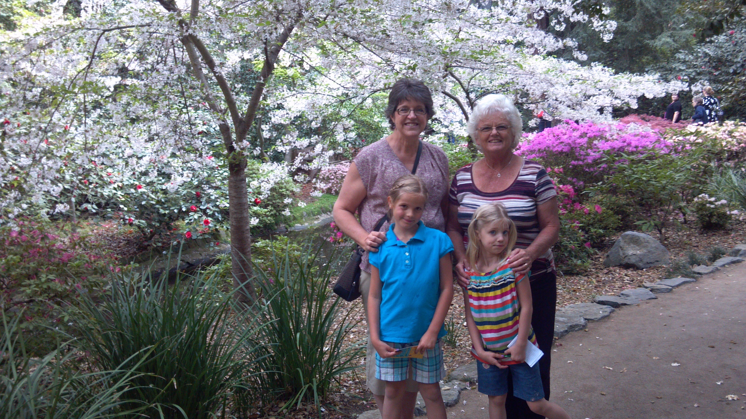
Grandmas and Granddaughters under a floral canopy
- FIRST, the pictures...Good timing, because last week, we had a "Girls' Day" at beautiful Descanso Gardens. (If you live nearby, you really MUST GO. Spring has Sprung!) While we were there I grabbed some close ups of the cherry trees to use for Julie's painting.

Ideas
- NEXT, I assemble my reference pictures, and Julie's ideas which will be used for layout, color, and theme. I did a bit of research and found that there are no true red blossoms on cherry trees, BUT, that's were artistic license comes in. From the pictures I saw, many trees appear red depending on the lighting, so no problem. "Red cherry blossoms" it is! This pool of ideas will also answer the following very important question: What exactly DOES a cherry blossom look like up close?

Bungalow Heaven neighborhood
- LAST BUT NOT LEAST, find the perfect font for the monogram. I want the monogram to reflect the "Arts and Crafts" style to be a good fit with her home. A bit of background here, because I want to explain the font choice, AND just for fun, because we LOVE this architectural style.
William Morris started the Arts and Crafts movement in England. His philosophy opposed the mass production of the Industrial Revolution and emphasized the individual craftsman and artisan who work with their hands using local natural materials. This followed the Victorian style with it's decorative embellishments and instead, emphasized simple, clean lines. In America, the "Craftsman" style is very evident in the Bungalow. In fact, nearby in Pasadena, you can explore the Bungalow Heaven neighborhood, to see the beautifully restored homes. Gary and I have driven around here as well as toured the Gamble House also in Pasadena.

Our California Bungalow home
One of the reasons we like the Craftsman style so much is that we had our own bungalow for 36 years. Here's what it looked like when we bought it.

Example of Arts and Crafts lettering
What does architecture have to do with fonts? We'll use the green sign at the right, to look at a typical Arts and Crafts font. Notice how simple the letters are? They almost look like the bungalow. No swirls, serifs, extras, etc. Just cool looking angular letters. I love this font, but not sure this particular "D" will look good as a stand alone letter.
SO.....
Sample fonts
I try out various fonts from the Arts and Crafts period (1860-1910 England, and about 1930 in America) to choose a "D" that will work.
You can see the contrast, from the Victorian era before, and the Art Nouveau and Deco, which came after. These are just a few that I looked at. Many more styles were
around between 1860 and 1930, but the one highlighted in blue works best for our painting. The "D" has a simple, slightly triangular shape, but a bit of style too.
LAYOUT:
It starts with a very simple line drawing. Just the shapes to establish the composition.


This is my very 'old school' method of transferring the layout to watercolor paper. Tape drawing to window, with drawing facing away. Shade with side of pencil the lines that show through the paper. (Hint: This will not work at night.)
Tape the drawing to the watercolor paper (or block) with the drawing side up. Trace the lines of the original drawing onto the watercolor paper. This keeps me from having to do all my sketchy work on the watercolor paper. I don't want to be erasing on it, and redoing much, because I don't want to damage the surface before painting.


Using some of my photos, I lightly draw in some of the details directly onto the watercolor paper. These photos are being used for shape and form, rather than color. These flowers are pink, but Julie's will be red.
I'll draw in the D later after the cherry blossoms are done.
Now we're ready to start. Looking forward to getting my paintbrush wet! That's next so stay tuned.
If at any point along the way you'd like to ask a question about the process, please leave a comment. I'd love to hear from you.