What's in a Name?

I'm a grandma...a happy, proud, privileged grandma.  When our daughters were expecting each bundle of joy, and once a name had been chosen, I began designing a painting for each baby.  These very special, custom paintings are some of my favorite projects ever.  I would love to paint one for you too!  Most people are surprised at some of the details, so I'm going to introduce you to one of these paintings, up close and personal.

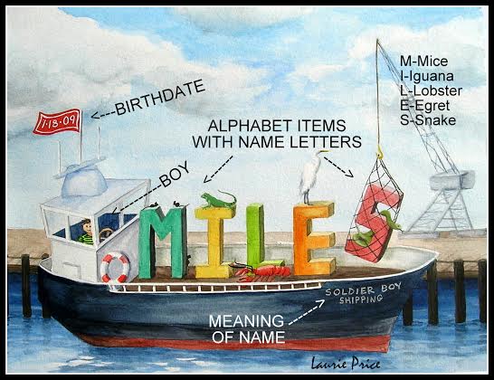
THE THEME:  This is the starting point. Because it's going to be displayed on the nursery wall, it should enhance the room decor such as Carnival, Western, Garden, Pirate, Woodland, etc.  THE NAME: The letters in the name are represented by objects which begin with each letter.  THE LITTLE ONE: A little boy or girl will be somewhere in the painting too.  THE MEANING OF THE NAME: I work the meaning of the name into the scene.  This is often the trickiest part because it must support the painting's theme.  THE BIRTH DATE: If the painting is given as a gift AFTER the baby is born, the birth date can also be included in the picture.

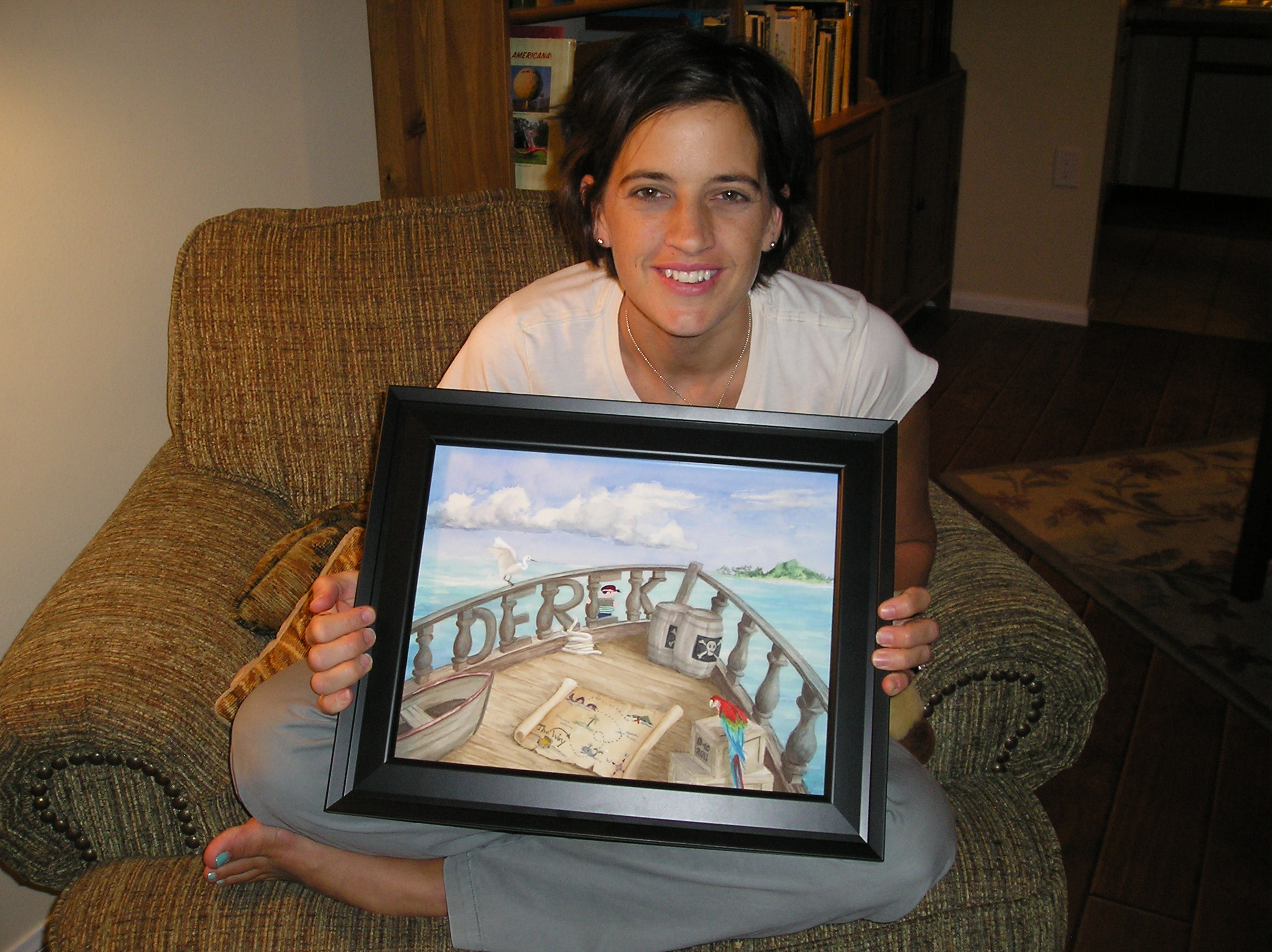
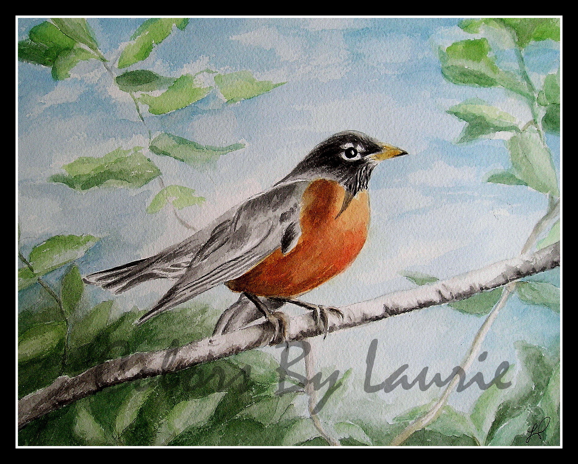
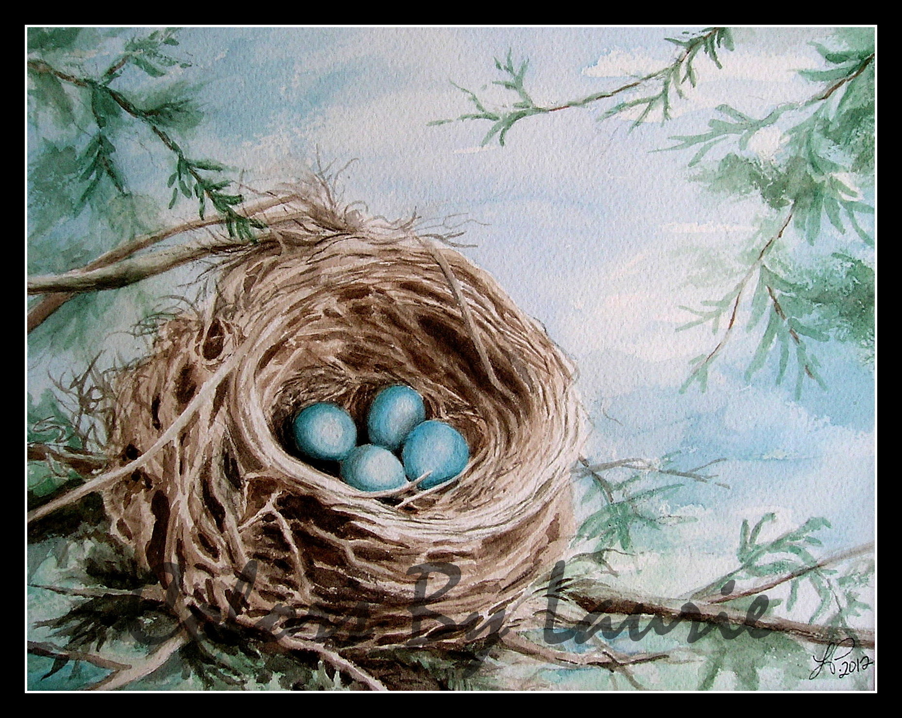
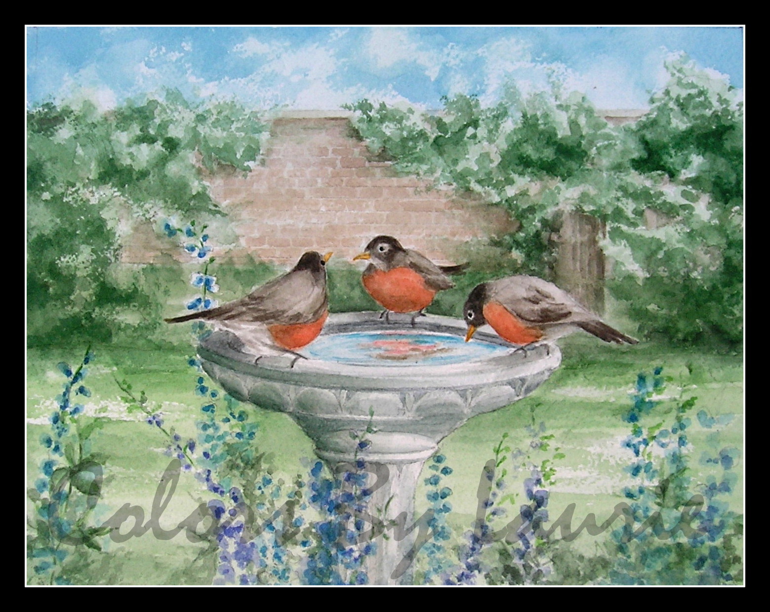
The Watercolorful Name paintings are the most complicated and thoughtful paintings I do as I am coordinating all these elements into a treasured family keepsake.  To learn more about ordering click HERE!

If you want to explore these paintings more, I'm having a TREASURE HUNT CONTEST on my Facebook page right now!  It ends Saturday at 6:00 pm.  The prize is 25% off of any item in my shop.  So, head on over to Facebook and look for Colors By Laurie to enter. 

We Have A Winner

2013-05-11_18-06-25_643.jpg

As promised in the last post, the contest ended today! 

At 6:00 pm our oldest grandson and oldest granddaughter,

took the stage as unbiased participants,

and assisted with finding the winner.

A name was drawn out of the jar! 

2013-05-11_18-11-16_762.jpg

That name was YOURS, RUTH PATTERSON!  So, Ruth, please contact me HERE before next Saturday, May ​18th to claim your prize.  Let me know which Secret Garden print you would like me to send to you and where to send it, and I'll get it to you asap!  ​

The "Secret Garden" Collection

Four 8" X 10" fine art prints from my original watercolors

based on the book, by Francis Hodgson Burnett 

"Thank You" to everyone...

for all your great ideas for future paintings.  I've written them down in my idea book.  ​It means so much to me that you would take the time to share them.  I hope you all have a wonderful Mother's Day tomorrow. 

Something Brand New & A Fine Art Giveaway

Behind the Wall

P5010029-009.JPG

My friend in the Midwest shared some precious photos with me this week.  She kindly said I may share them with you.  On her porch, a little mommy robin has taken up residence in her flower pot.  ​Evidently she felt it was the perfect secret little place to build her nest.  It is sheltered.  It is warm.  It is safe.  It is home, for now.

IMG_2800.jpg

I have always loved robins.  They're out and about every Spring and they live everywhere.  They ALWAYS remind me of the "cheeky little beggar" in "The Secret Garden" by Frances Hodgson Burnett.  He is the sassy little bird that is present in nearly every chapter.  He is the little orphan girl's very first friend.   He knows the secrets behind the wall, and he leads the way for her to a whole new world.  As the garden comes to life, so do the children who tend it.  This beloved children's classic, was a favorite of our family, and now our grandchildren are reading it too.  If you've never read it, even as an adult, I highly recommend it. 

Come on in!

The original 1911 cover.​

The original 1911 cover.​

I would like to invite you inside my very own "Secret Garden."​  I am excited to open the door for you and show you what's been growing here.  I've been putting together a collection of paintings based on this book and getting the fine art prints ready to share.

The robin inspires me with his industrious little life.  Like most birds, robins are always busy, searching out nesting spots, or gathering twigs.  While they are taking care of their responsibilities, we reap the benefits.  What is more lovely than blue robin eggs tucked into a well built nest?  How about Robin's red feathers contrasted with green grass as he tugs on a worm?

My husband, Gary has early-onset Alzheimer's Disease.  Through watercolor painting, I have found a way to express my love for the beauty around me, bless my husband, and provide visual delights for you to enjoy. Thank you for your support which allows me to stay by Gary's side.  I would be so grateful if you tell your friends as well. 

The "Secret Garden" Collection

Four original watercolor paintings and fine art prints

based on the book, by Francis Hodgson Burnett  ​

​The First  Big News

Along with these original 8 X 10 framed paintings, I'm offering FINE ART PRINTS!  This has been in the works for some time, so I'm thrilled to tell you about it.  You can purchase them framed or unframed.  You can buy a painting, or a print, or a set and each image comes with a journal entry with my thoughts.  These paintings and prints are ready to order.  Clicking on any image will take you to the gallery page for more details.  Or click HERE

The Other Big News!

A Fine Art Print Giveaway from this collection!  ​Here's how it works... If you win the drawing you choose the 8 X 10 print of choice from this collection.

  1. Leave a comment on this blog, (at the bottom of THIS page where it says COMMENTS) and tell me what subject you would like me to paint next.
  2. The drawing is going to be held on ​Saturday, May 11, 2013 at 6:00 PM PST. 
  3. I will post the winner's name on a new blog post that night.  The winner will have one week to contact me or I will draw a new name.  ​


IF YOU ARE ASKED TO 'CREATE AN ACCOUNT' OR 'LOG IN'

  • Create Squarespace Account:" Enter name, email and password.  THEN
  • "Log In:" Enter email, and password.  Then click "Sign In."​

IF YOU ARE AN ​EMAIL BLOG FOLLOWER:

  • You must "READ IN BROWSER" in order to leave a comment.

Like Mary in the story, I am grateful for the friends God has brought into my life.  Thank you for ​your interest, loyalty and love.  It's a joy to share my world with you.

​With Pleasure,

Laurie

Julie's painting is finished!

(​Continued from yesterday's blog.)

​This afternoon, I made the changes on my list.  I added a few more flowers both in the foreground and the background, to improve the composition.

P4170002-003.JPG

Here's a close up.​

​Now it is time to add the dark reds and greens.  By adding the shading, the flowers take shape and have depth.  It is shadows and highlights that give form.  I added the same reds and greens to the background flowers, but by "dabbing" them in, not "brushing" them in.  I want the background to look "fuzzy."  Finally I added all the details like the little sprigs, buds, and branches.  Feeling satisfied with these cherry blossoms, I smiled, and got ready for the final stage. 

Remember the font I chose in the planning stage?  In my Word program I formatted the letter for size.   

FINAL_LOGO_RGB_7.29.12-007.jpg
P4180001-003.JPG

Position the Monogram, making sure the size is right for the space.

Sometimes it takes a few tries to get it right. 

P4180002-002.JPG

Remember this step?  Use a pencil to darken the lines on the back side of the paper so it can be transferred to the painting.  ​I tape it to the window, to see the lines through the paper. 

I taped the "D" Monogram drawing on the painting and transferred the "D" to the painting by tracing the lines with my pencil.  Next, I carefully painted in the black.​ 

P4180003.JPG

So, Julie D., here is your painting.  I hope you like your prize.  I really enjoyed painting it for you, and I hope it finds a nice place in your Craftsman style home.  To the rest of you who have been looking over my shoulder these last few days, I've loved sharing with you.  I wish I could paint one for each of you.  It was a fun contest, and a treat to paint these red blossoms.  Springtime blessings to everyone!

"Red Cherry Blossoms" Monogram with digital watermark added

"Red Cherry Blossoms" Monogram with digital watermark added

Wet Brushes

P4170001.JPG

Continuing with Julie's painting.  With the planning and drawing done, today we paint!  I like to paint with natural light.  Sometimes I hang a white sheet in front of the window to prevent shadows.  ​

P4170003.JPG

Water...check

Brushes...check

Paints...check

Paper Towels...check

​First I paint in the background very lightly, to make sure I like the layout.  I mix up a good red that I like, and then thin it with water for the light parts.  The "light red" is not really going to look "pink" when I'm done because with watercolors you must start out with the lightest parts of the painting first, and darker and darker colors as you go along, leaving exposed the light parts where you want them.  You'll see better as we go along.  Don't worry Julie, these blossoms ARE going to be red NOT pink. 

You can click on the photos to enlarge them and there's a small X in the upper right to click when you want to come back to this page.​

Since I don't have a photographic memory, I rely on my reference photos.  When I took the photo, I held my purse behind the flowers so they would stand out clearly.   Never mind the colors in the photo.  I just needed it for the shapes.

Next come the flowers in the foreground.  They will be the main event in this painting.  Because they are near, they will be distinct.  The ones in the distance will be lighter, and less sharp.  ​

The flowers are just painted simply at this point with no shading yet.  ​

Darker red paint is added to the flower petals, to show their shape.  I am careful to leave the lighter parts alone and put the darker red only where the shading would be. In the distant flowers, I add some blotchy darker red because I will want them to look like a bunch of reddish blossoms, not cotton candy. 

​Periodically, I step back from the painting, and make sure I like the composition, and colors.

P4170001-002.JPG

At this point, it was nearing time to make dinner, and Gary needed to get up from his nap.  (Today he was in the recliner, in the sunroom with me which I like.)   When I'm done for the day, I prop up the painting and every time I pass by, I see things I want to do tomorrow.  I keep a little paper near it, and jot things down to change or add.  A little more red here, an additional branch there, add some flowers over here, etc. 

I'm often asked how long it takes to create a painting.  This is a hard question to answer because of all the in between "thinking/looking" I do. 

I've rinsed out my brushes, and straightened up my desk, but ​I can't wait to get working again tomorrow.  Have a good night all.

"I am so excited, I'm shaking! I never win anything!!"

On March 23rd, Julie's name was drawn.​ "YAY!"

On March 23rd, Julie's name was drawn.​ "YAY!"

"Thank you SO very very much!!", continued Julie D., the winner of our contest!  Julie's original watercolor painting is underway and just as I promised, I'll be giving a step-by-step look at how I create a painting.  (To celebrate my brand new website, I recently hosted a drawing.  You can read about it HERE if you're curious.) 

So let's get started...

DIALOG WITH CLIENT:​

Julie let me know that she would like a Personalized Monogram watercolor with the letter "D" for her family name.  She loves cherry blossoms, and since she likes browns, whites, creams and red accents, she would like them to be red.  Her home is "Arts and Crafts" style.  We emailed back and forth a few times so that I could get a feel for her tastes. 

PLANNING:​

Every artist works differently, but I really get into the preparation.  My assignment was to find great cherry blossom pictures to use for reference, AND choose a great font for the "D."  ​

Grandmas and Granddaughters under a floral canopy

Grandmas and Granddaughters under a floral canopy

  • FIRST, the pictures...Good timing, because last week, we had a "Girls' Day" at beautiful Descanso Gardens.​  (If you live nearby, you really MUST GO.  Spring has Sprung!)  While we were there I grabbed some close ups of the cherry trees to use for Julie's painting. 

​Ideas

​Ideas

  • NEXT, I assemble my reference pictures, and Julie's ideas which will be used for layout, color, and theme.  I did a bit of research and found that there are no true red blossoms on cherry trees, BUT, that's were artistic license comes in.  From the pictures I saw, many trees appear red depending on the lighting, so no problem.  "Red cherry blossoms" it is! This pool of ideas will also answer the following very important question:  What exactly DOES a cherry blossom look like up close? 

Bungalow Heaven neighborhood

Bungalow Heaven neighborhood

  • ​LAST BUT NOT LEAST, find the perfect font for the monogram.  I want the monogram to reflect the "Arts and Crafts" style to be a good fit with her home.  A bit of background here, because I want to explain the font choice, AND just for fun, because we LOVE this architectural style. 

William Morris started the Arts and Crafts movement in England.  His philosophy opposed the mass production of the Industrial Revolution and emphasized the individual craftsman and artisan who work with their hands using local natural materials.  This followed the Victorian style with it's decorative embellishments and instead, emphasized simple, clean lines.   In America, the "Craftsman" style is very evident in the Bungalow.  In fact, nearby in Pasadena, you can explore the Bungalow Heaven neighborhood, to see the beautifully restored homes.  Gary and I have driven around here as well as toured the Gamble House also in Pasadena.

Our California Bungalow ​home

Our California Bungalow ​home

One of the reasons we like the Craftsman style so much is that we had our own bungalow for 36 years.  Here's what it looked like when we bought it. 

Example of Arts and Crafts lettering

Example of Arts and Crafts lettering

What does architecture have to do with fonts? ​ We'll use the green sign at the right, to look at a typical Arts and Crafts font.  Notice how simple the letters are?  They almost look like the bungalow.  No swirls, serifs, extras, etc.  Just cool looking angular letters.  I love this font, but not sure this particular "D" will look good as a stand alone letter. 

​SO.....

Sample fonts

Sample fonts

I try out various fonts from the Arts and Crafts period (1860-1910 England, and about 1930 in America) to choose a "D" that will work. 

You can see the contrast, from the Victorian era before, and the Art Nouveau and Deco, which came after.   These are just a few that I looked at.  Many more styles were around between 1860 and 1930, but ​the one highlighted in blue works best for our painting. The "D" has a simple, slightly triangular shape, but a bit of style too.

LAYOUT:​

It starts with a very simple line drawing.  Just the shapes to establish the composition.

P4130005.JPG
P4130007.JPG

This is my very 'old school' method of transferring the layout to watercolor paper.  Tape drawing to ​window, with drawing facing away.  Shade with side of pencil the lines that show through the paper.  (Hint: This will not work at night.)

Tape the drawing to the watercolor paper (or block) with the drawing side up.  Trace the lines of the original drawing onto the watercolor paper.  This keeps me from having to do all my sketchy work on the watercolor paper.  I don't want to be erasing on it, and redoing much, because I don't want to damage the surface before painting.  

P4130002-001.JPG
P4130004-001.JPG

Using some of my photos, I lightly draw in some of the details directly onto the watercolor paper.  These photos are being used for shape and form, rather than color.  These flowers are pink, but Julie's will be red.​

​I'll draw in the D later after the cherry blossoms are done.

 Now we're ready to start.  Looking forward to getting my paintbrush wet!  That's next so stay tuned.

​If at any point along the way you'd like to ask a question about the process, please leave a comment.  I'd love to hear from you. ​

Beauty Captured with Word & Brush

Hello friends!   Step across my welcome mat, and come on in to my new website!  I've been sprucing things up with a new logo, a fresh layout, and I've been carefully placing the decor.  I’ve wanted to have you over for a long time, but we’ve been under construction, and not ready for guests until NOW.  If you have been visiting me on my blog, and now you’ve made your way here, you'll be glad to know I packed up my journal, “I Have Been Young,” and brought it with me to my cyber-home.  There are so many blank pages yet to be written on, I can hardly wait to share more.  I'm excited because moving in to my new website has allowed me to gather several areas of my life into one place, and since they are all related, I’m hoping you can settle in to a comfortable corner of my world and be enriched, encouraged or challenged in some way. 

FINAL_LOGO_RGB_7.29.12-001.jpg

As you can see, Colors By Laurie is the name of my new website (www.colorsbylaurie.com) and it's also the name of my watercolor business.  As you may know, I love COLOR.  (My “Welcome” page has the back-story on that.)  Also, at the top of the page, the journal entries from my blog are now sorted into areas of interest (Art, Family, Alzheimer’s and Lessons) so you can easily choose a collection to browse.  I’ve added links and resources that I’ve found personally helpful.  You are a very special guest and my 'e-door' is always open to you.  I hope you'll come back often, and invite your friends! 

My hope is that your visits here will enhance your life

through my artwork and writings.


LIVE

Friends, we live in the present moments!  Alzheimer’s Disease is a good reminder of that.  My husband may not remember the past, but he still feels the sun on his skin, hears the music and tastes the cinnamon roll.  Being fully committed to “the present” and not worried about the future, or trying to “live in the past” is a lesson I am really trying to learn and will continue to share my heart with you. 

560869_10152092576830484_913541169_n.jpg
IMG_1179.JPG

REMEMBER

Of course, we remember the past.  Memories can be vivid or faded, happy or sad, regretful or satisfying.  Finding ways to enhance the happy memories, and learning from the others, move me forward to growth.  I love finding creative ways to keep Gary connected to who he is through memories, and helping others preserve the beautiful and valuable moments from their lives with my artwork.

ENJOY

I want to encourage all of us to enjoy the here and now, the memories and whatever is around the corner.  Through my customized artwork, and journal writings, it is my sincere hope that your joy will be increased as well.

P2200007-002.JPG

I have a very special gift for one of you!

There will be a drawing on Saturday March 23, 2013 at 6:00pm Pacific Standard Time for an 8" X 10" original watercolor painting! The winner will choose either a Personalized Monogram or an Architectural Portrait.  The creation of the winner's painting will be featured on my blog for the rest of you as your consolation prize.  Start to finish, a behind-the-scenes look at of one of my customized watercolors!

RULES:

  1. Go to Home Page.
  2. Click on My Gallery.
  3. Browse my paintings.
  4. Make note of your favorite painting.
  5. Enter drawing either of the following ways.​

TWO WAYS TO ENTER:

  • Leave a comment at the end of this blog, and tell me which painting is your favorite.
  • Like my "Colors By Laurie" page on Facebook

You can enter the drawing 2 different ways which gives you 2 chances to win!  I'll add your name to the jar, post the winner on this blog AND my Colors By Laurie page next Saturday night (23rd).  Please check back.

IMG_1270.JPG
IMG_1193.JPG

I hope you enjoy looking around the rest of my new place for awhile.  Click HOME or BLOG at the top of any page to go back and forth.

Thanks for dropping by, and please come again!  

​IMPORTANT!

THE FIRST TIME YOU POST A COMMENT, YOU'LL BE TOLD YOU ARE NOT "LOGGED IN"​.  ON THAT SCREEN YOU WILL SEE A PLACE TO CREATE AN ACCOUNT WHERE YOU'LL ENTER NAME, EMAIL, AND PASSWORD, THEN YOUR COMMENT WILL SHOW.  I NEED TO KNOW WHO'S COMMENTING IN ORDER TO ENTER YOU IN THE DRAWING!