(Continued from yesterday's blog.)
This afternoon, I made the changes on my list. I added a few more flowers both in the foreground and the background, to improve the composition.
Here's a close up.
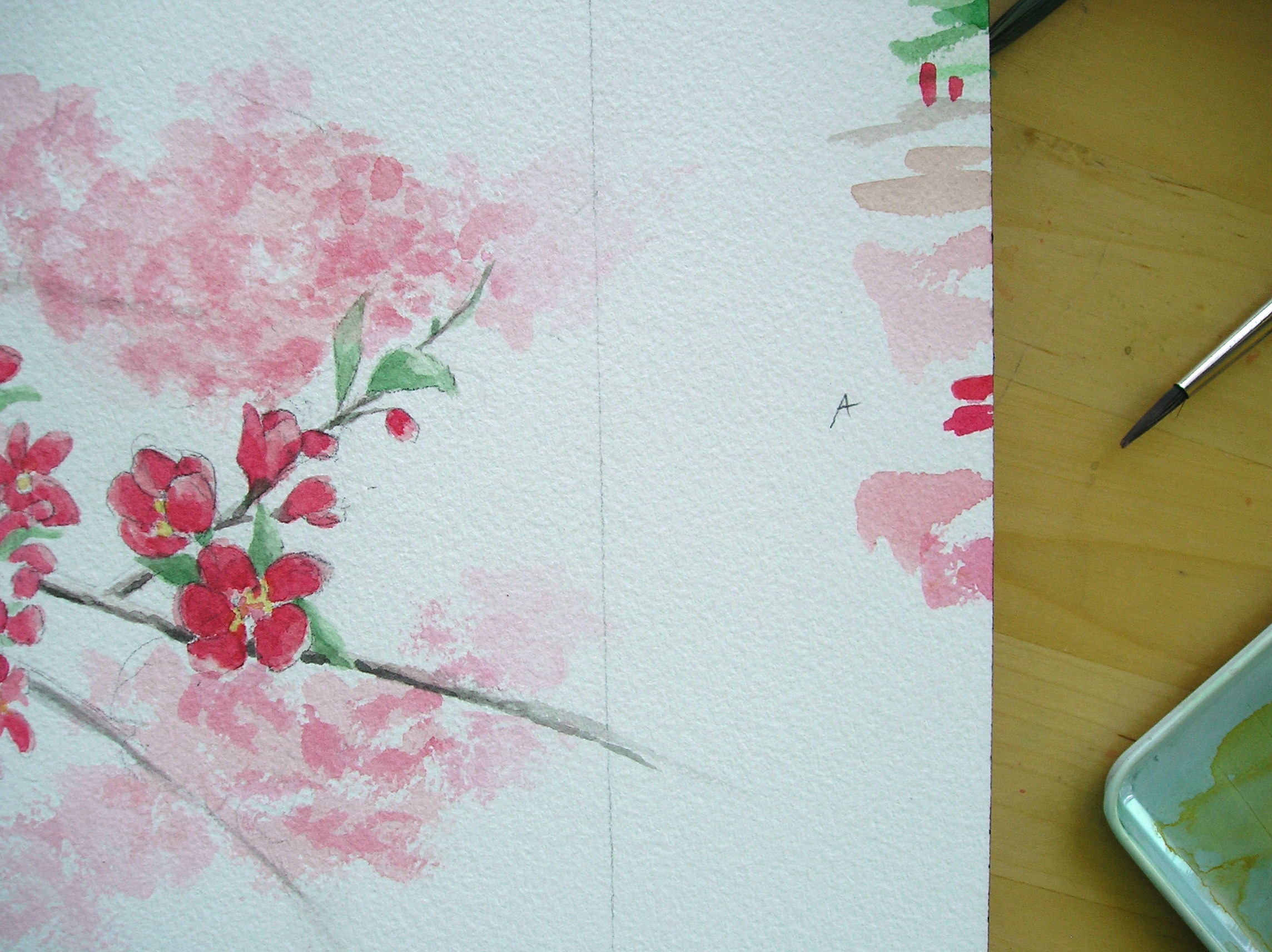
Now it is time to add the dark reds and greens. By adding the shading, the flowers take shape and have depth. It is shadows and highlights that give form. I added the same reds and greens to the background flowers, but by "dabbing" them in, not "brushing" them in. I want the background to look "fuzzy." Finally I added all the details like the little sprigs, buds, and branches. Feeling satisfied with these cherry blossoms, I smiled, and got ready for the final stage.
Remember the font I chose in the planning stage? In my Word program I formatted the letter for size.
Position the Monogram, making sure the size is right for the space.
Sometimes it takes a few tries to get it right.
Remember this step? Use a pencil to darken the lines on the back side of the paper so it can be transferred to the painting. I tape it to the window, to see the lines through the paper.
I taped the "D" Monogram drawing on the painting and transferred the "D" to the painting by tracing the lines with my pencil. Next, I carefully painted in the black.
So, Julie D., here is your painting. I hope you like your prize. I really enjoyed painting it for you, and I hope it finds a nice place in your Craftsman style home. To the rest of you who have been looking over my shoulder these last few days, I've loved sharing with you. I wish I could paint one for each of you. It was a fun contest, and a treat to paint these red blossoms. Springtime blessings to everyone!
"Red Cherry Blossoms" Monogram with digital watermark added


